Visualization of omics data
WIlsON
Main features
- Visualization for all kinds of omics data
- Easy to setup R shiny app
- Shiny modules allow to generate individual visualization frameworks
- Universal file format
I’m a demo server
WIlsON: Webbased Interactive Omics visualizatioN
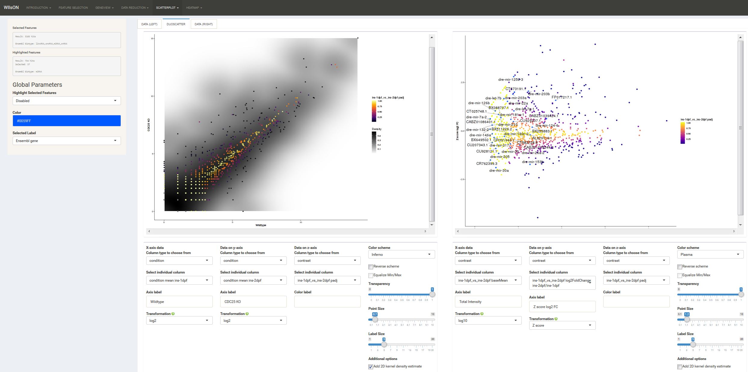
The WIlsON R package employs the R Shiny and Plotly web-based frameworks using a client-server based approach comprising a range of interface and plotting modules. These can be joined to allow a user to select a meaningful combination of parameters for the creation of various plot types (e.g. bar, box, line, scatter, heat). The modular setup of elements assures a concise code base and simplifies maintenance. An app thus created can be mounted on an R Shiny Server or inside R Studio. Data must be supplied server-side using a custom tab-delimited format derived from the SummarizedExperiment format (Clarion) and can principally originate from any analysis (e.g. RNA-Seq, ChIP-Seq, Mass Spectrometry, Microarray) that results in numeric data (e.g. count, score, log2foldchange, zscore, pvalue) attributed to a feature (e.g. gene, transcript, probe, protein).