Home
Who is WIlsON?
Explained: Step by step with the app
Choosing plots and plot types
Plot interfaces
Interactive plots
Specific Help
Fast track: use cases
Get your data on board with the CLARION input format
Contact and License
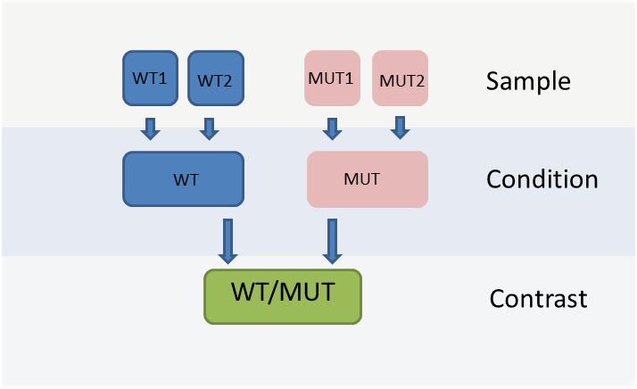
The WIlsON app is intended to interpret all types of quantitative data (e.g. multi-omics) which can be broken down to a key feature (such as genes or proteins) and assigned text columns and/or numeric values. It is designed to support common experimental designs by making use of individual data levels resulting from primary analysis, shown in the figure below.
The app provides a web-based analysis and visualization solution, realizing the basic idea to offer a flexible tool to the user without codifying any fixed or precalculated plots. This unavoidably leads to a certain degree of complexity. (And, the user should know what he/she wants to see:-) )
Once the experimental data is loaded into the app, the user can generate various plots following four basic steps:
- Filter for features of interest based on categorical (annotation) or numerical values (e.g. transcripts, genes, proteins, probes)
- Select plot type
- Adjust plot parameters
- Render/download result
Following these basic steps, various plots such as these example plots can be generated, including scatter plots, heatmaps, PCA, barplots, lineplots, etc.:


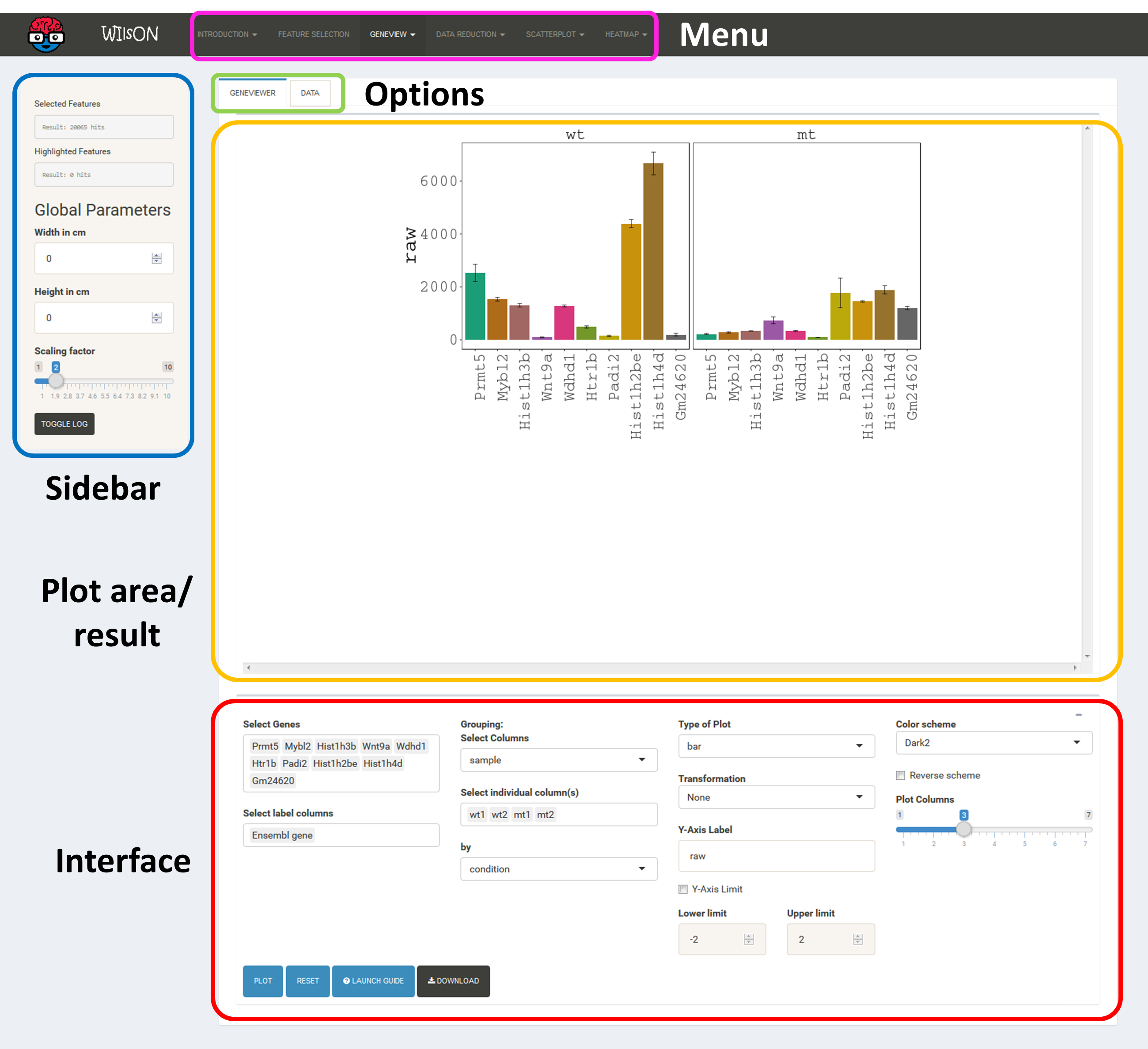
The app is separated into four main subsections, namely Menu (top), Sidebar (left), Plotting/Selection area (upper right) and Filtering/Plotting Parameter section (lower right). Depending on the selected pane in the menu, the sidebar, the plotting, and the filtering section might differ.
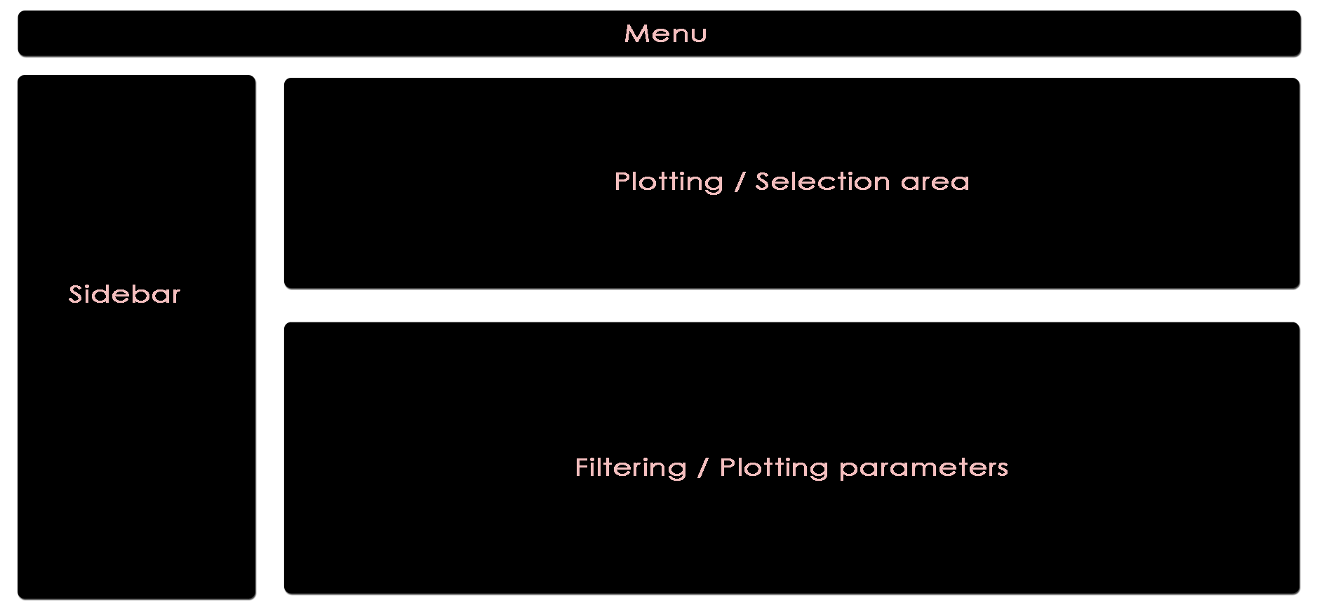
These two areas report on the current selection of features for default plotting (Selected Features) and special highlighting (Highlighted Features) including the respectively applied filters.
Global parameters are shown within the sidebar. For example, the input data file can be chosen here. Apart from various example data sets, the user can also upload custom data in CLARION format. When a distinct plotting type is selected in the menu, global parameters section can include image scaling factors, image size etc..
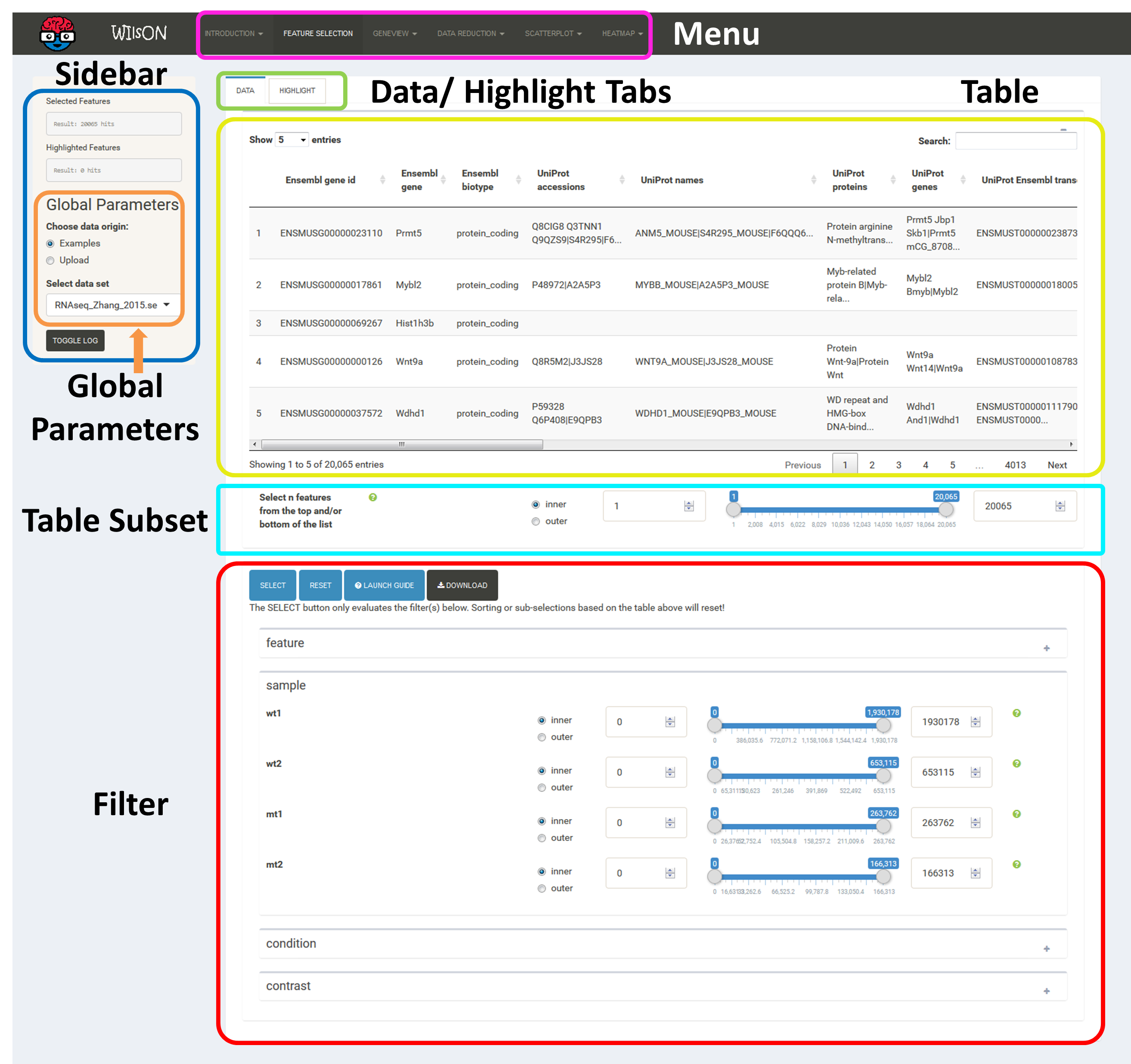
As mentioned above, the first step of using WIlsON after selection of the dataset of interest is to go to the tab "Feature Selection" in the top menu, where a subset of data to be used for plotting can be chosen. This is controlled by the additive application of filtering steps based on all data levels (sample/condition/contrast/feature) as defined in the input file. Prior to filtering, all data entries are shown, after adjusting filters just press the select button. If no filtering is desired, just press the "Select" button as well. If filtering is applied to the data columns, multiple entries (where possible) within one filter column are interpreted via logical OR operation, while multiple column filters are combined by logical AND operation.
After filtering, plots of interest can be selected and generated via the tabs on top. For most types of plots, a static version as well as an interactive version is provided.
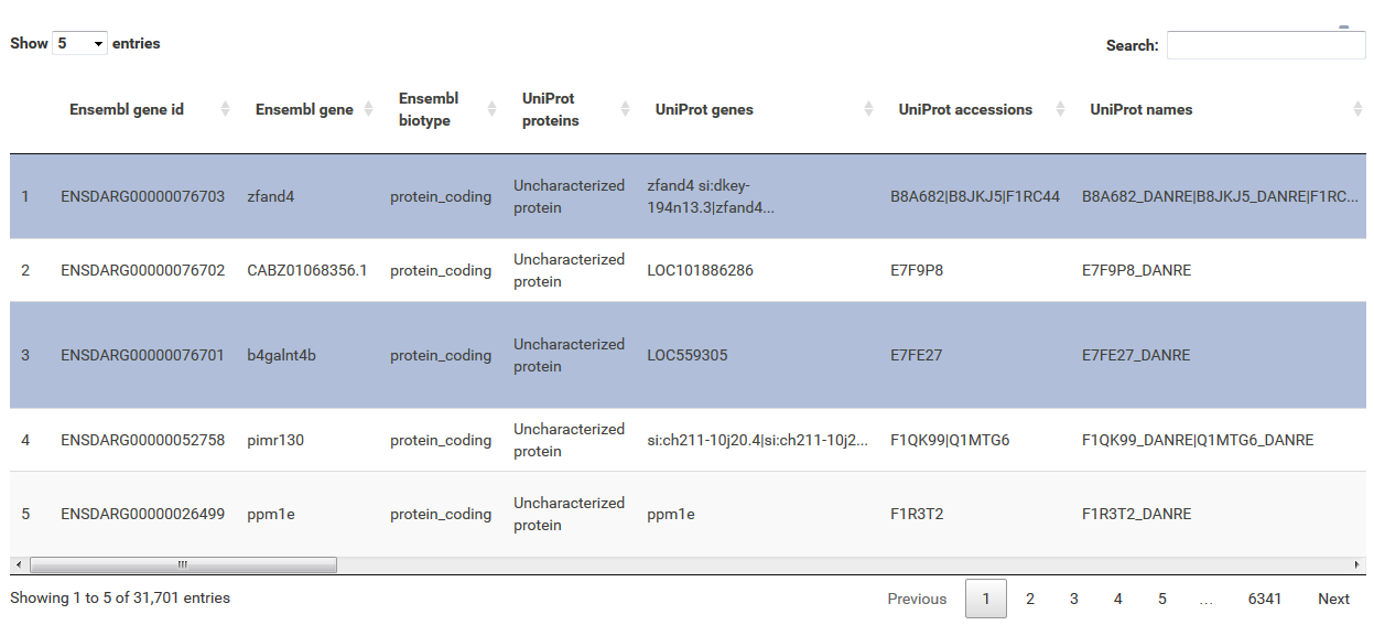
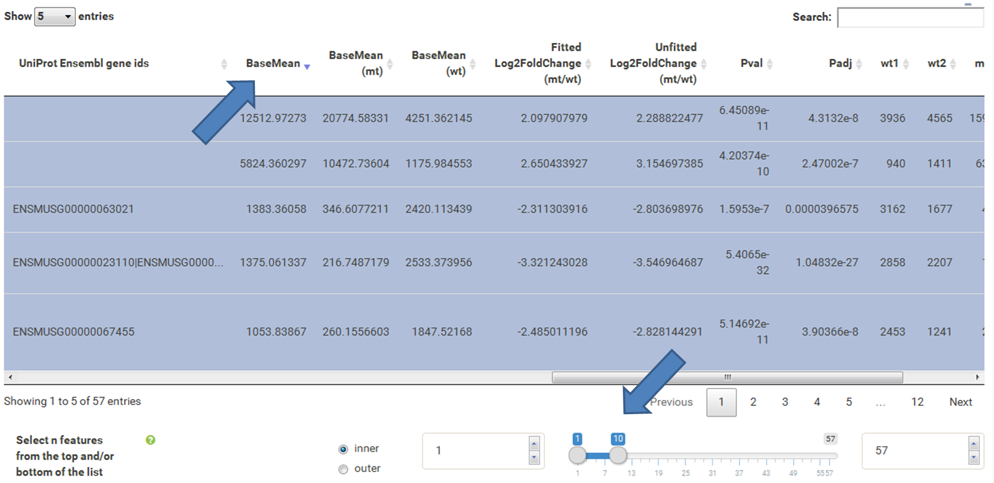
The table at the top of the "Feature Selection" page displays the current selection. It can be sorted ascending or descending according to any available data column. The selection can be narrowed down further by using the keyword search field on the top right of the table or by manual selection of rows (mouse click on row). Some cell values are truncated due to long text blocks('...'): to display these data just hover over the specific cell.

The current selection of features, as defined by the column filters below, can also be limited to the e.g. Top50 features according to a certain column value. This requires a previous sorting on the respective column to move the features inside the table into the correct order. This does NOT change the basket of selected features itself, but only limits the amount of features reported to the desired plot. As such it serves as a temporary sub-selection of the current selection of features as shown in the table. This functionality is controlled by a range slider, that can be used to select TopX/BottomX of features according to the current order. In combination with numeric filtering on e.g. fold changes, this can be used to e.g. generate a list of the Top50 up and down regulated genes (an operation often asked for by users).
Based on the column's content (text, numeric) WIlsON's Feature Selector will provide appropriate filter interfaces to enable an efficient way to select data. These are split among the levels of data (feature, sample, condition, contrast) given in the input data. Please make sure to press the SELECT button after your are content with your filters to update the basket!
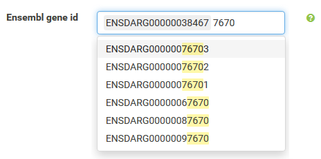
Annotations can be filtered by clicking a dropdown menu containing all available values. The filter box supports querying using partial key words as well. 'Backspace' can be used to deselect prior selections.

This filter is intended to select a numeric range. The 'inner' or 'outer' options allows the definition of either the range within the set markers (inner) or outside of the marker (outer), which is also displayed trough the slider coloring. As the step size is scaled according to the spread of the data (total range), editable value fields aside the slider can be utilized to change the minimum and maximum value (slider range is recalculated). This can be used to fine-tune the filter to e.g. use a very small value when the total range of the column is large. IMPORTANT: the slider defines the filter, not the value fields aside the slider.
The "highlight" pane supports the creation of a subset of the selected features. The highlighted data can be used in certain plots which support highlighting (e.g. scatterplot) to either add colors or labels. The highlight pane just populates, if features were already selected.
After feature selection, the typical workflow needs the selection of a plot type. Within this plot types, for the selected features all data colums can be assigned to axis, bars, transformations etc.
The type of plot can be selected from the top menu after the desired features were selected. Currently WIlsON provides a set of individual gene views, dimension reductions, scatterplots, and heatmaps. For all plots, first the parameters have to be selected (lower right), then the plot will be rendered by clicking the PLOT button.
 |
The Gene Viewer consists of multiple plot types including line-, box-, violin- and barplots. It supports the visualization and comparison of individual genes and/or conditions. |
 |
A PCA is used to get an overview on the variation of the data based on the selected features. By default the two dimensions with the highest variation are selected (PC1 and PC2) and presented in a two-dimensional scatterplot. |
 |
Similar to the PCA, this plot will show the global clustering of samples or conditions based on the selected features. A distance matrix is created using one of various options (e.g. euclidean, pearson, spearman, etc.) and visualized by a heatmap. |
 |
This plot illustrates the dependency of two (X/Y axes) or three (X/Y/color) attributes. It supports a density estimation (kernel smoothing) and trend lines. The axes to be displayed can be chosen among the numeric columns to e.g. create Volcano, MA, or other kinds of scatter plots. The scatterplot supports highlighting of a subset of data (feature selection, pane highlight). |
 |
Various parameters permit the creation of highly customized heatmaps of the selected features. Among these are different kinds of clusterings, transformations (log2, log10, zscore), and color schemes. The Heatmap module supports interactive and static heatmaps. |
The layout of plot interfaces is fairly similar. The top bar permits selection of a plotting application while the remaining space is usually divided the following way:
It shows the currently selected features as well as global parameters depending on the plot/filter.
These tabs provide access to several subsections: plots, filters or data tables. Tables contain the specific subset of data used for the plot.
This area will show the result of the current rendering/filtering: either a plot or the data as a table.
The bottom interface contains most of the parameters defining a plot, including axis transformation, coloring etc.
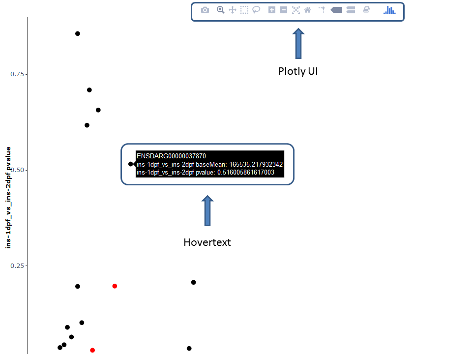
Thanks to the plotly package, several plots are available as interactive versions offering a range of additional options:
- Zoom / pan plot (either via UI or directly in plot)
- Mouse-over popup text box containing information of the selected feature
- Download currently selected viewport
It should be noted that the plotly versions are slower and more demanding on the processing power than the default ggplot2 versions.
- All interfaces include an interactive help section. Click on
 for a step by step tour on how to use the current interface.
 - Further details considering specific interface elements are available with the
 symbols.
See example data used within the demo and find the use case files here.
Short description: RNASeq Zhang 2015 , downloaded from GEO dataset GSE66822
Skeletal muscle stem cells play an important role for maintenance and regeneration of adult skeletal muscles. Here, the function of the arginine methyltransferase Prmt5 within skeletal muscle stem cells is investigated. it is reasoned that Prmt5 generates a poised state keeping these cells in a standby mode, thus allowing rapid amplification under disease conditions.
For both conditions (WT/MUT), two RNA-seq libraries were measured resulting at least 40M reads per library. Raw reads were QA assessed, trimmed and terminally aligned to mm10 genome. Differentially expressed genes were identified using DESeq2. Standard DESeq output format was annotated and transformed to CLARION format.
The example table includes 10 columns of level feature, namely annotations from various sources(ensemble and uniprot based IDs, gene symbols ect.), normalized counts for all 4 individual samples as level sample, summarized values for the replicates as conditions, and finally 5 columns on the pairwise comparison as contrast level (log2FC, pvalue etc.)
Dataset: RNASeq Zhang 2015
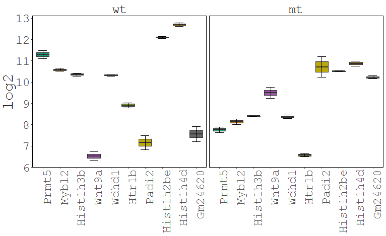
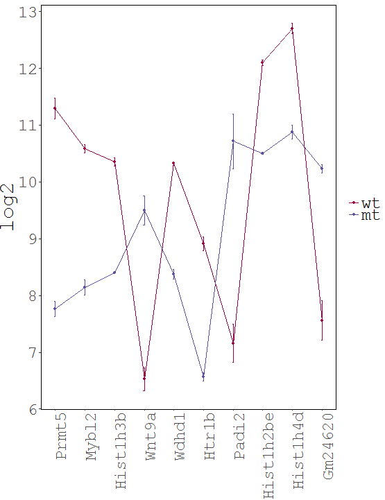
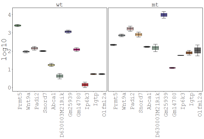
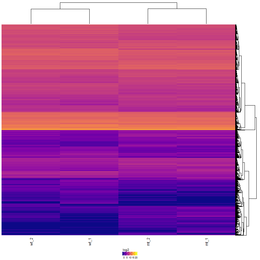
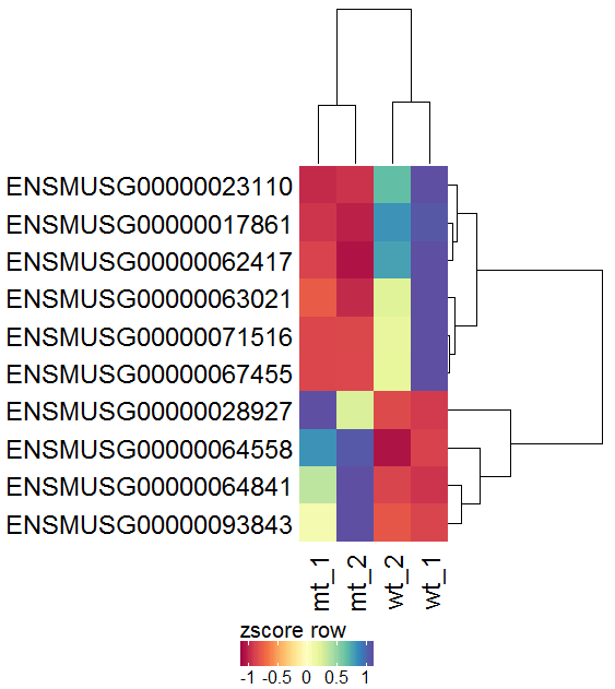
Task: Create a heatmap comparing expression levels between wildtype (wt) and mutant (mt). Only select genes which are significantly differentially expressed and only use the top 10 considering the mean expression over all samples (BaseMean).
Step by step solution: In order to filter, use the Feature Selection tab. For this example we want to filter for significantly differentially expressed genes, which is done on the contrast level. Set the following thresholds using inner/outer in combination with the range slider: fitted log2 fold change less than -2 or greater than 2 and p-value smaller than 0.1 (of course, these cutoffs are exemplarily). As the latter might be difficult to select due to the tiny interval, change the max value of the slider using the box on the right side (essentially a zoom). Finally apply the filter by clicking on the SELECT button above.

Now the filtered table will be shown on top of the page. To select the genes with the highest BaseMean click on the BaseMean column until the columns values are descending (arrow down). Further narrow it down by utilising the slider directly below the table to select the Top 10 genes.
| Now with this selection of features move on to the heatmap module (here not interactive). Select the samples and click on the plot button. | 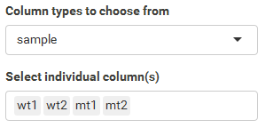 |
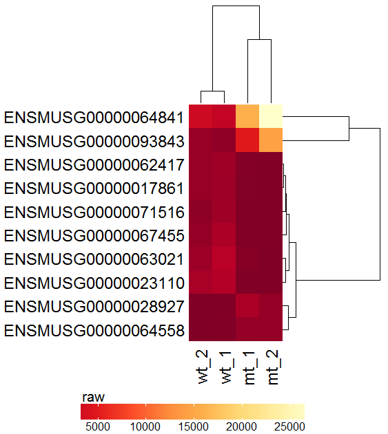 |
| The resulting plot is troubled by the large range of the values (5000-25000) which can complicate the recognition of patterns. A row-wise z-score Transformation might help. | 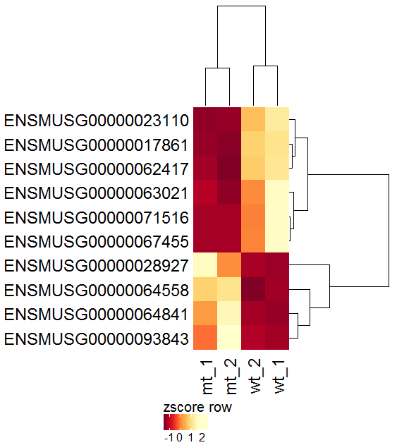 |
|
| Since the z-score transformation leads to a diverging (2-sided: -x..0..+x) distribution of values, another color palette would be optimal. Set Data distribution to diverging and select the spectral color scheme. |  |

|
| As the values are not evenly distributed the color legend is not centered at 0. To solve this set winsorize to -1 and 1 for a nicely centered color legend. | 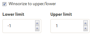 |
|
| For an easier interpretation set the row labels to show the Gene names rather than the Gene ID. |
|

|
Dataset: RNASeq Zhang 2015
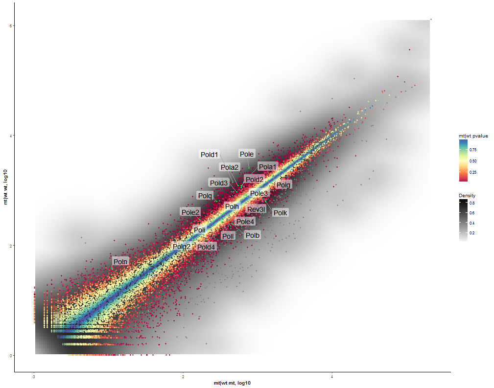
Task: Compare wildtype (wt) versus mutant (mt) conditions and show the expression differences adn significance using a scatter plot. Also highlight/label all genes which highly differentiate between conditions.
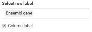
| As this example is about a comparison on the whole dataset there is no need for filtering. Simply load the correct dataset and proceed to the scatterplot (here static simple scatter). Now select from the column type condition for the x-axis wildtype (wt) and the y-axis mutant (mt). | 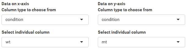 |
 |
| With most of the genes being located in the lower part of the range there is a lot of overlapping. A log2 Transformation applied on both x- and y-axis will solve this. | 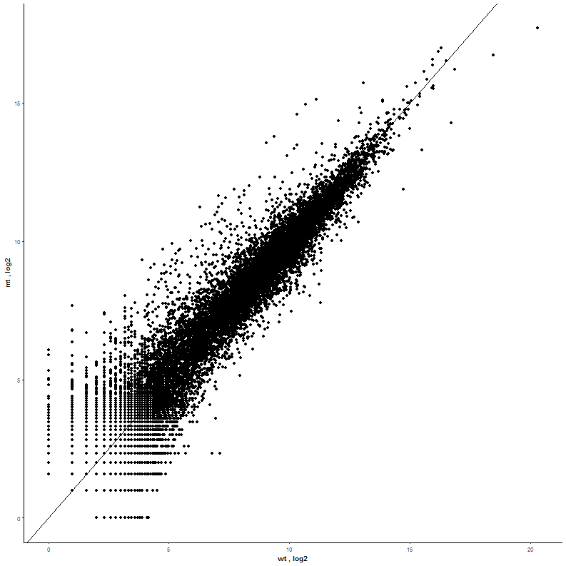 |
|
| This plot already shows a comparison between wt and mt so the next step is adding the significance via z-axis color mapping. To achieve this select the adjusted p-value (Padj) from the column type contrast. |  |
 |
| In addition select a fitting color scheme (e.g. Inferno). | 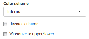 |
 |
| Set the Point Size to 1.6 for a better distinction between points. |  |
 |
| For more insights about the density distribution enable a 2D kernel density estimate and disable the reference line as well. |  |
 |
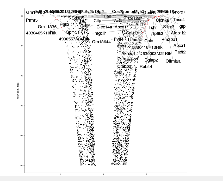
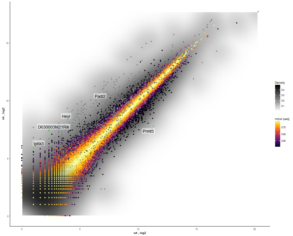
The final step is to add the highlighting of highly differentiated genes between conditions. To do so go back to Feature Selection, select the highlight-tab and filter for the respecting features.

Filter for highly differentiated genes between conditions by first expanding the contrast panel and then setting the "Fitted Log2FoldChange" to select values less than -3 or higher than 3 (feel free to change cutoffs). Apply the filter by clicking the SELECT button. Note: The filter will display an empty table on default meaning there is nothing highlighted.

| Return back to the scatterplot. Set the highlight/label options in Global Parameters (left side) choose Highlight to enable highlighting based on the beforehand filtered features, select a specific color for the respecting points (here green) and define a label (here Ensemble gene). | 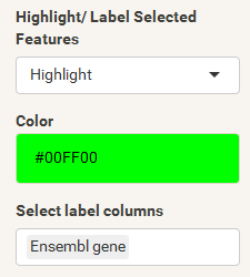 |
 |
Dataset: RNASeq Zhang 2015
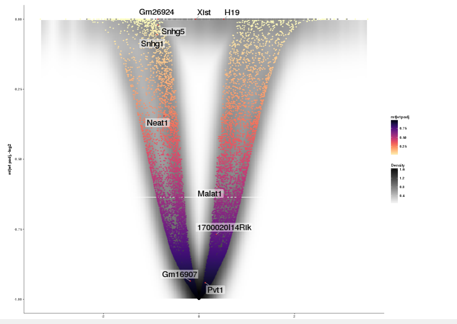
Task: Create a scatterplot of non-coding RNAs including labeling of those with the most prominent up-regulation
| First select non-coding RNAs on the feature level: Ensembl biotype = miRNA, lincRNA, antisense. Then switch to the Scatterplot/Simple Scatter tab: choose the X-axis data to be type condition, column wt, transformation log2, and Y-axis data to be type condition, column mt, transformation log2. This will compare the mean normalized counts per condition of the selected non-coding RNAs. | 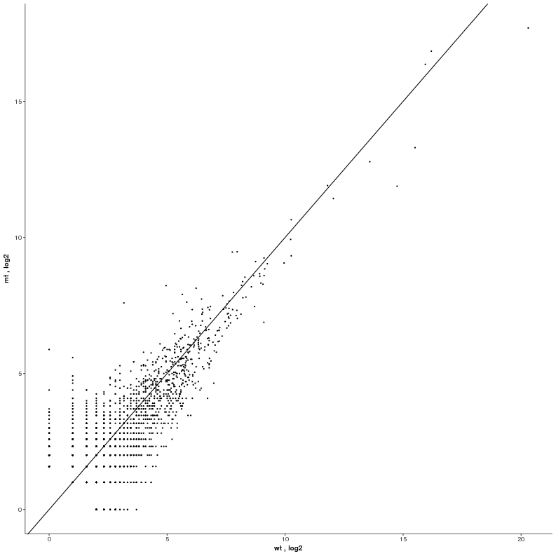 |
| In order to color the scatterplot by Log2FC please choose Z-axis to be type contrast and column Unfitted Log2FoldChange (mt/wt). Furthermore set the Color scheme to Diverging/BuWtRd. The resulting plot shows RNAs up-regulated in the mt condition using red dots. But the colors are slightly pale and do not seem to be centered around 0. |  |
| Tick Winsorize to upper/lower, then set Lower limit to -1 and Upper limit to 1 to modify the color palette range to be more intense and centered around 0. |  |
| Next please go back to the Feature Selection tab and switch from the Data to the Highlight sub-tab to select a subset of features to be labeled inside the plot. Open the contrast level and select BaseMean >= 100 and Unfitted Log2FoldChange (mt/wt) >= 0.5 to get RNAs with a certain minimum expression and up-regulated in the mutant. Now switch to the Scatterplot/Simple Scatter tab again and set the Highlight/Label Selected Features on the side bar to Highlight. Furthermore change Select label column to Ensembl gene to use the gene symbol for display as a label. | 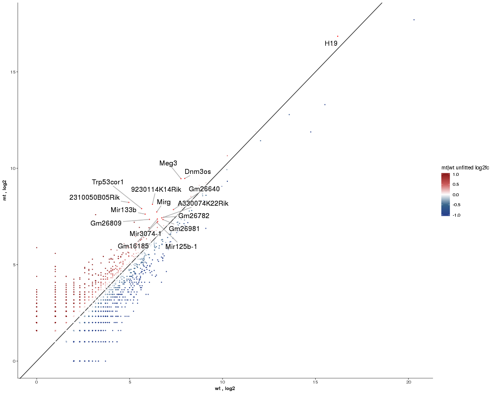 |
CLARION: generiC fiLe formAt foR quantItative cOmparsions of high throughput screeNs
CLARION is a data format especially developed to be used with WIlsON, which relies on a tab-delimited table with a metadata header to describe the following columns. It is based on the Summarized Experiment format and supports all types of data which can be reduced to features and their annotation (e.g. genes, transcripts, proteins, probes) with assigned numerical values (e.g. count, score, log2foldchange, z-score, p-value). Most result tables derived from RNA-Seq, ChIP/ATAC-Seq, Proteomics, Microarrays, and many other analyses can thus be easily reformatted to become compatible without having to modify the code of WIlsON for each specific experiment.
Please check the following link for details considering the CLARION format.
WIlsON was created by Hendrik Schultheis, Jens Preussner, Carsten Kuenne, and Mario Looso.
Bioinformatics Core Unit, Max Planck Institute for Heart and Lung Research, Bad Nauheim, Germany.
Copyright (C) 2017. This project is licensed under the MIT license.
The source code for the modular WIlsON R package is available on Github.
The source code for the WIlsON application implementing that package is available on Github.
The container for the WIlsON application is available on Docker.